Planning Blog: Title Design
The opening credits of my film will appear in a rugged font that appears to be “typed” into the middle and around the corner of the screen.
Some credits, though few, will be embedded in the setting. For example, credits will be written on the folders and in the evidence when he is with Brain in the restaurant.
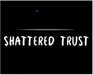
Working Title: The title of this film is likely to be “Shattered Trust”
It will be in Valden font and in all Caps: Shattered Trust
Titles will all be “Typed” onto the screen. They will come on as being typed and disappear with a cut effect on the text.
Titles will disappear after 2 or 3 seconds with it flickering.
Depending on the color of the scene I will be using Black Font. The names would have a completely different look to the main title. Something like this: DIRECTED BY: DANIEL
Each name will be 4 sizes smaller than the names.


Comments
Post a Comment